B2C
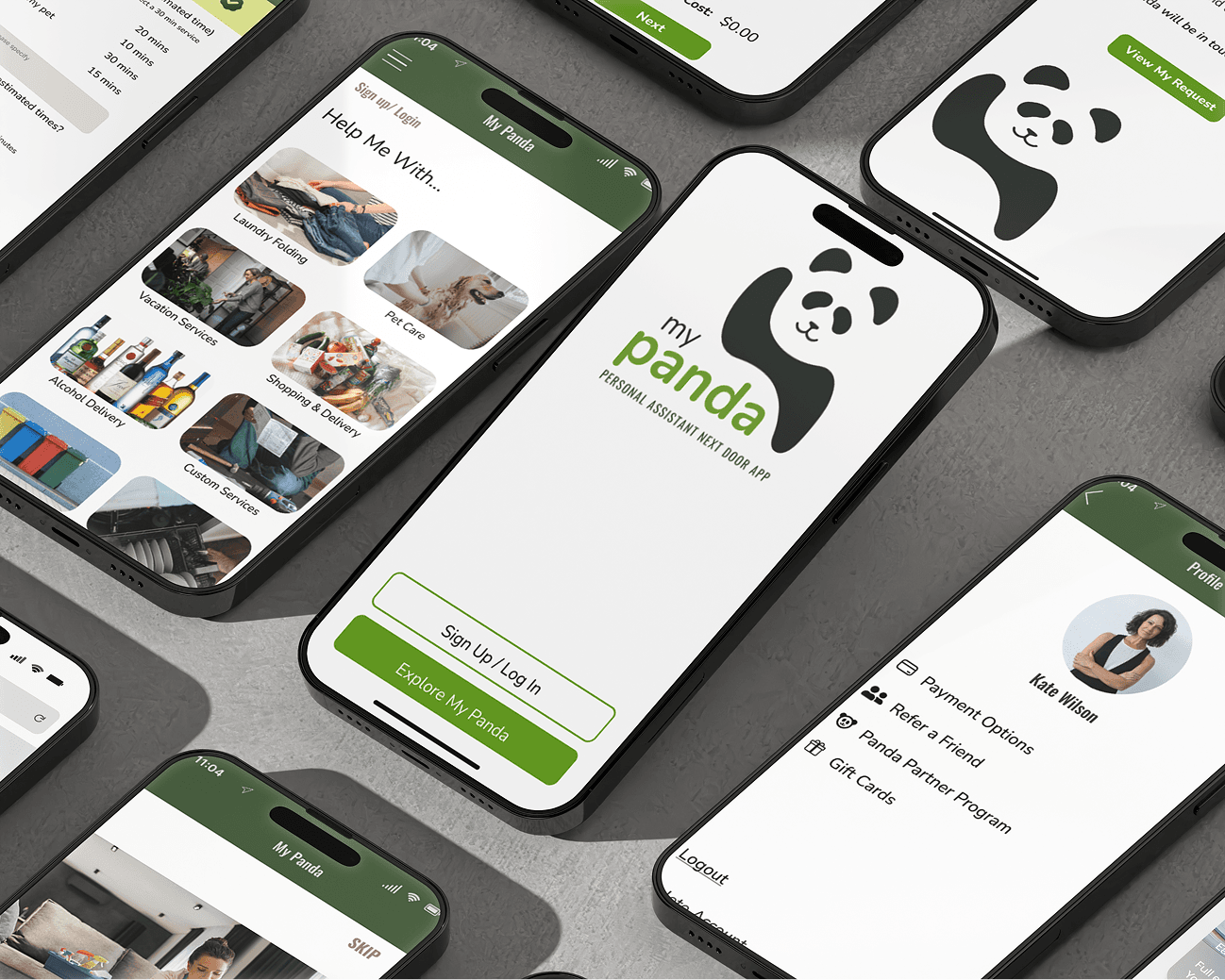
MY PANDA
My Panda, an app connecting working women with local personal assistants, struggled with user confusion and high abandonment rates. As the lead designer, I spearheaded a complete app redesign, focusing on user interviews to understand core issues. By implementing an intuitive onboarding tutorial and a transparent, tiered-pricing booking process, we significantly increased user understanding and confidence. This resulted in a 54.47% increase in SUS score, a 22% decrease in app abandonment, and a 17% increase in revenue, proving that clarity and trust are key to conversion.
My Role
My Role
Lead UX / UI Product Designer
Industry
Industry
Gig Economy
Contributions
Contributions
App Redesign / UX Research / UI Design / Product Design / Information Architecture
Redefining Convenience and Boosting Confidence: Redesign for a Local Assistant App That Connects People with Trusted Help, Right Next Door
Redefining Convenience and Boosting Confidence: Redesign for a Local Assistant App That Connects People with Trusted Help, Right Next Door
Overview
Overview
CHALLENGE
My Panda (Personal Assistants Next Door App) aimed to be a lifeline for working women, connecting them with trusted help for everything from grocery runs to home cleaning. It was a brilliant concept: a modern day TaskRabbit, but with a community-focused, personal touch. However, despite its promising premise, the app was struggling. Users were downloading it, but then getting lost in a confusing booking process, leading to high abandonment rates and a significant loss in potential revenue.
Biggest Friction?
Confusing Booking Flow
Unclear Pricing
No Onboarding for First Time Users
Our initial hypothesis was that the app simply needed more clarity in its UX and a more polished UI. But without direct conversations with our users, we knew we risked building the wrong MVP. The real problem, we discovered through crucial user interviews, wasn't just a lack of clarity – customers simply didn't understand how the current app functioned at all. They weren't completing the checkout process, nor were they upgrading their services because they lacked the confidence to spend their money on something they didn't fully comprehend. This realization was our "aha!" moment, shifting our focus from surface-level fixes to a complete overhaul of the user journey, from download to booking and checkout.
SOLUTION
With insights from our user interviews, we set out to rebuild My Panda with user understanding and confidence at its core.
Demystifying the First Impression with Onboarding: The existing app offered no guidance for new users, leaving them adrift from the moment of download. Recognizing this critical gap, I spearheaded the design and iterative testing of an intuitive onboarding carousel for first-time users. This guided introduction quickly familiarized them with My Panda's value proposition and core functionalities, setting them up for success from the start.
Transparent Booking, Empowered Choices: The original booking process was a black box. Customers were unsure what services they were selecting, let alone how much they would pay, until the very last step. This lack of transparency was a major barrier to conversion. My solution involved designing and rigorously testing a transparent booking process. This new flow clearly outlined service details and pricing upfront, and crucially, allowed customers to easily see and select tiered pricing add-on services with discounts. This not only provided clarity but also incentivized users to explore and upgrade their service packages.
Through a continuous cycle of "test, design, test, re-design," we refined every interaction, ensuring that each step of the user journey was intuitive, reassuring, and aligned with user expectations.
RESEARCH
RESEARCH
To truly understand My Panda's challenges, we knew we couldn't rely on assumptions. My approach was to dive deep into the lived experiences of both sides of the platform: the customers booking services and the "Pandas" (personal assistants) providing them. This dual perspective was crucial for uncovering every highlight and every pitfall.
Customer Insights: Beyond the Click
Our initial hypothesis pointed to UX clarity and UI polish, but direct conversations with customers quickly revealed a more fundamental issue: a pervasive lack of understanding about the app's core functionality. Users were getting lost, not just in the booking flow, but in grasping what My Panda truly offered and how to effectively utilize it. They lacked the confidence to spend their money because the value proposition and process were opaque.
A personal anecdote perfectly illustrates this challenge. Based in Denver, I couldn't directly use the Atlanta-based My Panda app. So, I enlisted a close friend in Atlanta to act as a proxy user. Armed with my credit card, he attempted to book a laundry service. To our surprise, this service was unavailable – Pandas only folded and put away laundry, they didn't wash it. Even more critically, he received no email notification about this unavailability. His first impression, after eventually settling for a toilet paper delivery, was telling: "The app felt like 3 teenage boys had a good idea and made an app in their garage. Besides that, everything ran smoothly." This immediate, unfiltered feedback confirmed our gut feeling about the UI's initial presentation and the critical need for clearer service descriptions and communication.
Panda Perspectives: Streamlining the Service Side
Beyond the customers, understanding the Pandas' workflow was equally vital. Interviews with the personal assistants revealed their own set of pain points related to task management, communication with clients, and understanding service expectations. Their insights were invaluable in ensuring that any redesign not only improved the customer experience but also streamlined the operational side for the Pandas, making their work more efficient and enjoyable.
By immersing ourselves in these user journeys – both the booking experience and the service delivery – we gained a holistic understanding of the app's strengths and weaknesses. This comprehensive research phase was the bedrock upon which our subsequent design decisions were made, ensuring we addressed the root causes of abandonment and confusion, rather than just superficial symptoms.